Friday, December 19, 2008

2nd Quarter


This was a pretty hectic quarter for me. Fall always seems to be anyways. I am SO glad it's over! I don't know why, but this was a very stressful 10 weeks for me! Maybe it's because I had InDesign, and I can't stand that program!! It's very boring to me. I guess I will probably not be working in the magazine field anytime soon! ha! I'll stick to labels. Illustrator is way more fun for me. Despite that, I STILL got an A in InDesign. Which, lets face it, wasn't hard. I still stressed about my final, but it all came together at the end. I got 100% of my points over all for the class. Yay me! I'm not going to bother posting any of the work I did here because, frankly, it's boring, and there isn't much to see! It was mostly in class work anyways. Not too much on the creative side.
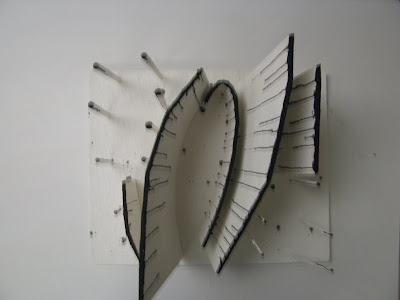
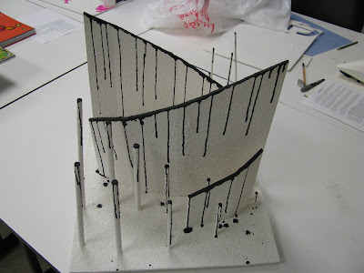
Form and Space, on the other hand, was fun! I think I got the point of the whole thing by the end, and the projects were enjoyable, so that's what I'm going to post. The first project was a real pain in the a**, but once I finally had my breakthrough, I really got into it. The process was strange to me. We had to pick ten magazine images, and then trace the parts that we felt were focal points, or interesting. Then we had to combine the ten in different ways to come up with thirty new sketches. This was the part I found to be useless. A lot of the new sketches wound up being pretty redundant. And I wasn't sure exactly where we were going with the assignment, so I was baffled by the work load. But suddenly, around sketch number 23 or 24, I had a breakthrough and I was able to see things in the abstract manner that we were supposed to be looking for. I made the connection I guess. Next we had to pick the five we liked best and refine them on bristol using black ink. That wasn't too bad. The we mounted those five and picked the one we liked best to enlarge into a plan of sorts. The plan would be used to create a model out of foam core. This is where things got fun. 
The building phase was hard in the beginning. It's hard to take something from 2D and make it 3D. But, again, I had a breakthrough and really went to town. After we built the model, we then had to add texture to it. Most everyone used some type of construction paper, except one fun person who used those bottle brush things which looked pretty cool. I chose to use spray on dry wall texture, not knowing how much I would wind up spending on it in the long run. That stuff runs 20 bucks a can, and I used 5 cans!! Never again, but I liked the results! I wanted to leave the whole thing white. I liked how it looked without color, but during the critique, a few people mentioned that they thought it needed color to make it stand out more. I am STILL not 100% convinced that it's better with color. You have to know when to let things be the way they are. I think what happened was most people are afraid of so much blank space. I heard the comment a lot that the whole model made them feel "uneasy". I LOVED to hear that!! But, I added the color anyways since this is a class, not a personal project. All in all, I like it, and it's sitting in the student gallery/lobby as I type.


Next we had to do a couple of collages. One of texture, and one a typography collage. The texture collage was pretty straight forward. Find pictures that have good texture, and arrange them in an rows on 11 x 17. The typography collage was a pain in the a** also. We had to pick a theme, and then cut individual letters out of magazines and arrange them to represent the theme. I chose "envy" so I cut out all green letters to surround the word "envy". Green with envy. Get it? hehe


There's more to post. We had another group project that came out pretty decent. I'll post those pictures later. Right now, it's time for the chirstmas party at work! Yay Booze! And I'm going to relax finally since this quarter contributed to many a sleepless night. What ever will I do with myself for three who weeks? Work on my personal art I maybe?


Wednesday, October 8, 2008

More Color Theory....

Here are some more color theory projects. These were based on Josef Albers' theories on color. Many of you know I am obsessed with Piet Mondrian and De Stijl, so it was fun for me to do these projects, as these are in some ways related to his art. These projects all used Color-Aid packs, and let me tell you people, Color-Aid isn't cheap! I'm going to have to do something constructive with the rest of pack so I don't feel like I wasted my money.

The projects.....

One of the basic idea of color theory being the idea that color can not be viewed independently of it's surroundings. The first project was "One color as two". We had to pick two different colored backgrounds that made one color look as if it were actually two different colors (that would be the first image). From far off, the small middle squares look as if they are the same color, but when examined side by side, they are actually two different colors. The next one was the reverse of that. to make two colors look as one using the same technique. Lastly I have an example of reverse ground. The grey and yellow used in both examples are actually four different colors, but they should look like only two. The unfortunate thing about these projects is that the scan process kind of changes the values so they don't look as good as they do in person.

There were other projects, but they just didn't scan well enough on my small home scanner to make it worth while to post. The last thing we did in this class was the process book, which I'll try and post pictures if soon. 

So that was pretty much it for color theory. It doesn't look like much, but let me tell you, that was a rough ten weeks. I think I slept a total of 5 hours for the whole quarter! It was pretty time consuming. I guess that's all for now..........until next quarter!


Wednesday, October 1, 2008

More of last quarters work

I finally found some time to add some more stuff from last quarter. All of it is from color theory. I also have some essays from English that I wound up doing really well on, but I doubt you want to read my research  on Piet Mondrian ;) If you do, email me! My final grades for the quarter were as follows: 

Fund. Of Observational Drawing: A (I don't this this teacher did a point system)
Color Theory B+ (ALMOST an A 89%)
English A (98%)

On with color theory.......

I really loved this class. It was a lot of fun, and I am a total nerd when it comes to this sort of thing. I wound up being only a couple of points off from an A in this class :( It's the only B on my record in two years, but it's all because of my forgetting to turn in my color journal, so all in all, I actually did really well in the class. I'm not TOO upset about the whole B+ thing, but I HAVE considered retaking the class if it's at all possible. Who cares about spending an extra 1500 bucks at this point! But that's another story.......here's some color theory work

For some reason I can't get the images to post in order, but anyways.....the color wheel was actually the first project. It's a split primary color wheel that I clearly could have done better on. And perhaps, if I had redone this assignment for a better grade, I might have gotten an A. GAH! I was lacking in craft in the beginning.

The next project was the value scales. This required a lot of taping and patience.......a virtue that I don't posses. Oh well, I got it done, and with some improvements in my skills at that. I hated this project at first, but I wound up liking it so much that I'm sure I'll be doing similar things on my own. I told you I was a nerd for color theory.

Next was an intensity exercise. I really didn't like the out come of either experiment. Adding grey to lower intensity in the top scales, and adding the compliment of a color to lower intensity for the bottom scales. One looks dull, the other looks like mud. But my craft improved even further. I wound up getting 100% in both design and craft for this one. Yay me.

The final painting project was all about color harmonies.(it actually appears as the first image here) Each block represents a certain color scheme. I really did like this one a lot, even though it took for EVER to get done. I think my grade was 100% for design, and 97% for craft or something along those lines. 

There were a bunch more assignments in this class, but I decided to separate the painting from the color aid projects for the sake of brevity.........which was lost about 18 paragraphs ago. I warned you I loved this subject!

Thursday, August 21, 2008

some of my work


So I finally had some time to upload a few assignments that I have worked on. The first one is a drawing of a piece of crumpled up paper. The purpose was to understand highlights and shadows without color getting in the way. I don't really know how I feel about this. We spent about an hour and a half on this. I think I got as much as I could out of it. I admit, it was kind of boring, but I got the point.

Next is the dog. Another assignment about learning to shade and how to get different tonal ranges with pencil. Not too complicated yet, but it's an improvement anyways.

Finally, the still life arrangement. I'm mostly satisfied with this one. I need to re-work the background area that's supposed to be the wall. It's too dark and it's kind of dragging the whole thing down with it. I'll lighten it up, and I'll probably rework the highlights in general. Just to get some stark contrast and make it more interesting. I'll be revisiting this drawing in pen wash today. I wasn't thrilled with it at first, but I'm beginning to like it!

I have no grades to report on these assignments. We don't really get graded. Well, I'm sure we have been graded, what I meant to say was, we haven't been told a grade. Then again, I haven't bothered to ask. 

So there you have it. 

Tuesday, August 5, 2008

Hello

Hello everyone!

So I got the brilliant idea today to create a blog about my adventures in art school. My sudden burst of brilliance came to me during my search for information on a project for my color theory class this morning. I am simply having no luck in finding examples of what this whole color board thing is supposed to look like, be like, feel like, include etc...etc.... And I thought to myself........."self? why aren't there examples of this project online? why aren't there hundreds of versions of color boards floating around the internets for me to catch an idea from??.......why am I so stressed out over something so silly??" And with that, the idea was born. I will create my own host of information. I will blog about the projects I have been doing for each class, give examples of my work, and maybe even include my grades, no matter how good or bad they may be. This way, other students in the future won't be quite as lost as I am. At least, that's my hope. Even if I failed at a project miserably, at least you'll all know what not to do right? Maybe I'll even learn from my own mistakes! How exciting! I don't intend this to be a display of my personal work. If you'd like to see what I do outside of school, email me or track me down in person. I'd love to show you! But in the interest of my obsessive compulsive disorder, I need to keep things categorized! School with school! Work with work! :) 
I also thought this might be a good way to relieve some stress, and maybe get to know some of my fellow art students. So if your a student going to school with me, drop me a line! I'd like to think we can all help each other trough the tough spots. Lets face it, we all have different talents. We are all good at different things. I might need your help someday! If your one of my friends just coming by to see what I've been up to, don't be a jerk! Post some constructive comments! Join in the fun! Be a pal! Just because you aren't in school with me, doesn't mean you can't help me out with your thoughts. 

I think I have said enough for today. You all get the point. I'll be posting some artwork over the next couple of days.